
Use una ventana emergente modal para agregar atributos adicionales con registerBlockFormat
Hemos echado un vistazo a la aplicación de formatos al contenido de su publicación con registerFormatType. Pero, ¿y si queremos añadir colores adicionales a nuestro rotulador?
En esta guía, vamos a expandir lo que trabajamos anteriormente y agregar una ventana emergente modal que nos permitirá seleccionar un color de resaltado.
Tenga en cuenta que en esta ventana emergente modal podría contener cualquier número de elementos, incluidos iconos personalizados, imágenes o incluso campos de formulario.
Todo el código utilizado en este tutorial se puede encontrar en el complemento gratuito ‘Highlighter’.
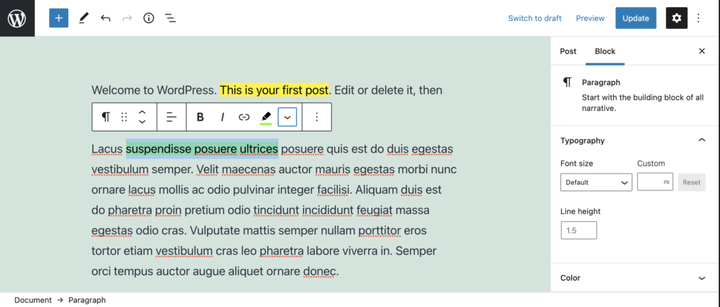
Aplicar un tipo de formato usando el complemento Highlighter.
El video de arriba muestra el complemento Resaltador, nuestro tipo de formato y la ventana emergente en acción. Saltemos a ello.
requisitos previos
- Lea la guía Creación de un complemento para el editor de bloques de WordPress (Gutenberg) para que pueda comenzar a crear el complemento.
- Siga los pasos del artículo Dar formato al contenido de su publicación con registerFormatType.
- Opcionalmente , descargue el complemento gratuito ‘Highlighter’ de GitHub y mire el archivo
/src/formats/highlight-colours.js
Crear el modal
Para crear el popover modal, vamos a usar el estado, para determinar si se ha hecho clic en el botón o no. Para realizar esta importación useStatedesde '@wordpress/element'.
Dentro del componente de botón, arriba de la declaración de devolución, vamos a usar esto para establecer un estado inicial y crear nuestras funciones de establecimiento de estado.
 // State to show popover.
 const [ showPopover, setShowPopover ] = useState( false );
Luego vamos a modificar el evento de clic del botón para establecer el estado.
onClick={() => {
    setShowPopover( true );
} }
Ahora que el estado está configurado, podemos usarlo para activar el popover. Primero importe el URLPopovercomponente desde '@wordpress/block-editor'. Luego, dentro de la declaración de retorno, debajo del botón, agregue un condicional que tome la showPopovervariable y represente el URLPopover.
return (<>
    <RichTextToolbarButton
      icon='edit'
      onClick={() => {
        setShowPopover( true );
      } }
      title={ __( 'Highlight', 'wholesome-highlighter') }
      />
    { showPopover && (<URLPopover
        className="components-inline-color-popover"
        onClose={ () => setShowPopover( false) }
        >
        ...
      </URLPopover>) }
    </>)
Tenga en cuenta que hemos envuelto los dos componentes con etiquetas vacías <></>. Estos cumplen el propósito de la <Fragment>etiqueta y permiten que dos componentes JSX se representen sin generar marcas en la interfaz.
Agregue el contenido emergente modal
Debido a que este es un complemento de resaltado, vamos a importarlo ColorPalettey '@wordpress/block-editor'colocarlo en la ventana emergente modal.
<URLPopover
   className="components-inline-color-popover"
   onClose={ () => setShowPopover( false) }
 >
 <ColorPalette
    onChange={ (color) => {
      setShowPopover( false );
      if (color) {
        onChange(
          applyFormat( value, {
            type: name,
            attributes: { style: `background-color: ${color};` },
          }
        ));
      } else {
        onChange( toggleFormat( value, { type: name }) );
      }
    } }
    />
</URLPopover>
El código anterior utilizará la paleta de colores predeterminada en la ventana emergente. Se necesitará más trabajo para agregar nuestros colores personalizados.
El código en su totalidad
Para demostrar cómo agregamos colores personalizados a la paleta, probablemente sea mejor mostrar el código completo. También puede descargar este archivo, junto con las últimas actualizaciones de Github.
import { ColorPalette, RichTextToolbarButton, URLPopover } from '@wordpress/block-editor';
import { useState } from '@wordpress/element';
import { __ } from '@wordpress/i18n';
import { Icon } from '@wordpress/icons';
import { applyFormat, registerFormatType, toggleFormat, useAnchorRef } from '@wordpress/rich-text';

import '../style.scss';

const name = 'wholesome/highlighter';
const cssClass = 'wholesome-highlight';

const HighlighterButton = (props) => {
    const { contentRef, isActive, onChange, value } = props;
    const { activeFormats } = value;
    const anchorRef = useAnchorRef( { ref: contentRef, value } );

    const highlighterIcon = <svg width="20" height="20" viewBox="0 0 20 20" fill="none" xmlns="http://www.w3.org/2000/svg">
        <path d="M14.2186 3.31061C13.7838 2.89252 13.0834 2.89708 12.6543 3.32078L9.22512 6.70711C9.17494 6.75668 9.13068 6.80978 9.09236 6.86558L7.36613 8.57021L11.393 12.4419L16.362 7.50771L16.6812 7.1925C17.1103 6.76879 17.1056 6.08638 16.6708 5.66828L14.2186 3.31061Z" fill="black"/>
        <path d="M6.81914 9.10588L10.8041 12.9457L9.79592 13.9391C9.42424 14.3053 8.84982 14.3575 8.42039 14.0938L7.83675 13.8883L7.01822 14.6819L5.03321 12.7381L5.86163 11.9349L5.67624 11.454C5.39121 11.0373 5.43547 10.4692 5.811 10.0992L6.81914 9.10588Z" fill="black"/>
        <path d="M5.11329 13.6189L6.13911 14.5945L5.70907 15L4 14.592L5.11329 13.6189Z" fill="black"/>
    </svg>;

    const [ showPopover, setShowPopover ] = useState( false );
    const [ activeColor, setActiveColor ] = useState( false );

    const colors = [
        { name: 'Yellow', color: '#fff300' },
        { name: 'Green', color: '#79fe0c' },
        { name: 'Blue', color: '#4af1f2' },
        { name: 'Purple', color: '#df00ff' },
        { name: 'Red', color: '#ff2226' },
        { name: 'Orange', color: '#ff7b19' },
        { name: 'Pink', color: '#ff70c5' },
    ];

    const getActiveColor = () => {
        const formats = activeFormats.filter( format => name === format['type'] );

        if (formats.length > 0) {
            const format = formats[0];
            const { attributes, unregisteredAttributes } = format;

            let atts = unregisteredAttributes;

            if (attributes && attributes.length) {
                atts = attributes;
            }

            if (! atts) {
                if (activeColor) {
                    return { backgroundColor: activeColor };
                }
                return;
            }

            if (atts.hasOwnProperty('class')) {

                const parts = atts.class.split( '--' );
                const colorName = parts[ parts.length - 1 ];
                const selectedColor = colors.filter( item => colorName === item.name.toLowerCase() )[0];
                return { backgroundColor: selectedColor.color };
            } else if (atts.hasOwnProperty('style')) {

                const { style } = atts;
                const parts = style.split( ': ' );
                const selectedColor = parts[ parts.length - 1 ].replace( ';', '' );
                return { backgroundColor: selectedColor };
            }
        }
    };

    return (<>
        <RichTextToolbarButton
            icon={
                <>
                    <Icon icon={ highlighterIcon } />
                    { isActive && (<span
                            className="format-library-text-color-button__indicator"
                            style={ getActiveColor() }
                        />) }
                </>
            }
            key={ isActive? 'text-color': 'text-color-not-active' }
            name={ isActive? 'text-color': undefined }
            onClick={ () => {
                setShowPopover( true );
            } }
            title={ __( 'Highlight', 'wholesome-highlighter') }
        />
        { showPopover && (<URLPopover
                anchorRef={ anchorRef }
                className="components-inline-color-popover"
                onClose={ () => setShowPopover( false) }
            >
                <ColorPalette
                    colors={ colors }
                    onChange={ (color) => {
                        setShowPopover( false );
                        setActiveColor( color );

                        if (color) {
                            const selectedColor = colors.filter( item => color === item.color );
                            const attributes  = {};
                            if (selectedColor.length) {

                                attributes.class = `${cssClass}--${selectedColor[0].name.toLowerCase()}`;
                            } else {

                                attributes.style = `background-color: ${color};`;
                            }
                            onChange(
                                applyFormat( value, {
                                    type: name,
                                    attributes,
                                }
                            ));
                        } else {
                            onChange( toggleFormat( value, { type: name }) );
                        }
                    } }
                />
            </URLPopover>) }
        </>) };

registerFormatType(
    name, {
        className: cssClass,
        edit: HighlighterButton,
        tagName: 'mark',
        title: __( 'Highlight', 'wholesome-highlighter' ),
    }
);
Asegúrese de establecer los colores para sus colores personalizados en el /src/style.scssarchivo, y ahí lo tiene, un formato de rotulador resaltador con paleta de colores.
.wholesome-highlight {
    &.wholesome-highlight--yellow {
        background-color: #fff300;
    }

    &.wholesome-highlight--green {
        background-color: #79fe0c;
    }

    &.wholesome-highlight--blue {
        background-color: #4af1f2;
    }

    &.wholesome-highlight--purple {
        background-color: #df00ff;
    }

    &.wholesome-highlight--red {
        background-color: #ff2226;
    }

    &.wholesome-highlight--orange {
        background-color: #ff7b19;
    }

    &.wholesome-highlight--pink {
        background-color: #ff70c5;
    }
}
 Resaltador icono de color seleccionado
- Agregue una barra lateral de bloque con InspectorControls
- Mire el uso de metacampos de publicación en bloques de Gutenberg
- Mire el uso de opciones y configuraciones en bloques de Gutenberg
- Mire la creación de una página de opciones y configuraciones usando componentes de Gutenberg