
Utilizzare un popup modale per aggiungere attributi aggiuntivi con registerBlockFormat
Abbiamo dato un’occhiata all’applicazione di formati al contenuto del tuo post con registerFormatType. Ma cosa succede se vogliamo aggiungere ulteriori colori al nostro evidenziatore?
In questa guida espanderemo ciò su cui abbiamo lavorato in precedenza e aggiungeremo un popup modale che ci consentirà di selezionare un colore di evidenziazione.
Nota che in questo popup modale potrebbe contenere un numero qualsiasi di elementi, incluse icone personalizzate, immagini o persino campi modulo.
Tutto il codice utilizzato in questo tutorial può essere trovato nel plugin gratuito ‘Evidenziatore’.
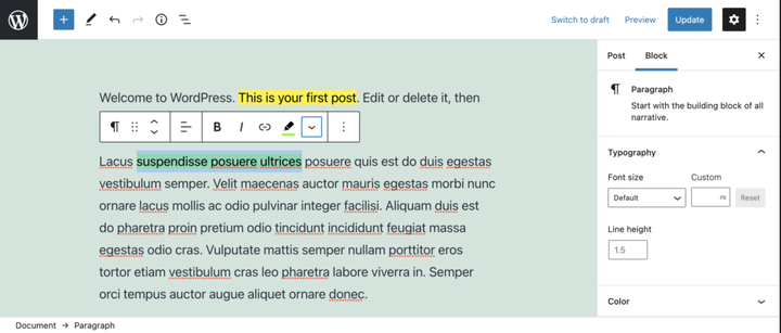
Applicazione di un tipo di formato utilizzando il plug-in Evidenziatore.
Il video sopra mostra il plug-in Highlighter, il nostro tipo di formato e il popup in azione. Saltiamo ad esso.
Prerequisiti
- Leggi la guida Creazione di un plug-in per l’editor di blocchi di WordPress (Gutenberg) in modo da poter ottenere un vantaggio nella creazione del plug-in.
- Segui i passaggi nell’articolo Formattare il contenuto del tuo post con registerFormatType.
- Facoltativamente , scarica il plug-in ‘Evidenziatore’ gratuito da GitHub e guarda il file
/src/formats/highlight-colours.js
Crea il modale
Per creare il popover modale, useremo state, per determinare se il pulsante è stato cliccato o meno. Per fare ciò importa useStateda '@wordpress/element'.
All’interno del componente pulsante, sopra l’istruzione return, lo useremo per impostare uno stato iniziale e creare le nostre funzioni di impostazione dello stato.
 // State to show popover.
 const [ showPopover, setShowPopover ] = useState( false );
Quindi modificheremo l’evento clic del pulsante per impostare lo stato.
onClick={() => {
    setShowPopover( true );
} }
Ora che lo stato è impostato, possiamo usarlo per attivare il popover. Prima importa il URLPopovercomponente da '@wordpress/block-editor'. Quindi all’interno dell’istruzione return, sotto il pulsante, aggiungi un condizionale che prende la showPopovervariabile e rende il file URLPopover.
return (<>
    <RichTextToolbarButton
      icon='edit'
      onClick={() => {
        setShowPopover( true );
      } }
      title={ __( 'Highlight', 'wholesome-highlighter') }
      />
    { showPopover && (<URLPopover
        className="components-inline-color-popover"
        onClose={ () => setShowPopover( false) }
        >
        ...
      </URLPopover>) }
    </>)
Nota che abbiamo racchiuso i due componenti con tag vuoti <></>. Questi servono allo scopo del <Fragment>tag e consentono il rendering di due componenti JSX senza generare markup sul frontend.
Aggiungi il contenuto popover modale
Poiché si tratta di un plug-in evidenziatore, lo importeremo e ColorPalettelo '@wordpress/block-editor'inseriremo nel popover modale.
<URLPopover
   className="components-inline-color-popover"
   onClose={ () => setShowPopover( false) }
 >
 <ColorPalette
    onChange={ (color) => {
      setShowPopover( false );
      if (color) {
        onChange(
          applyFormat( value, {
            type: name,
            attributes: { style: `background-color: ${color};` },
          }
        ));
      } else {
        onChange( toggleFormat( value, { type: name }) );
      }
    } }
    />
</URLPopover>
Il codice sopra utilizzerà la tavolozza dei colori predefinita nel popover. Sarà necessario più lavoro per aggiungere i nostri colori personalizzati.
Il Codice per intero
Per dimostrare come aggiungiamo colori personalizzati alla tavolozza, è probabilmente meglio mostrare il codice completo. Puoi anche scaricare questo file, insieme agli ultimi aggiornamenti da Github.
import { ColorPalette, RichTextToolbarButton, URLPopover } from '@wordpress/block-editor';
import { useState } from '@wordpress/element';
import { __ } from '@wordpress/i18n';
import { Icon } from '@wordpress/icons';
import { applyFormat, registerFormatType, toggleFormat, useAnchorRef } from '@wordpress/rich-text';

import '../style.scss';

const name = 'wholesome/highlighter';
const cssClass = 'wholesome-highlight';

const HighlighterButton = (props) => {
    const { contentRef, isActive, onChange, value } = props;
    const { activeFormats } = value;
    const anchorRef = useAnchorRef( { ref: contentRef, value } );

    const highlighterIcon = <svg width="20" height="20" viewBox="0 0 20 20" fill="none" xmlns="http://www.w3.org/2000/svg">
        <path d="M14.2186 3.31061C13.7838 2.89252 13.0834 2.89708 12.6543 3.32078L9.22512 6.70711C9.17494 6.75668 9.13068 6.80978 9.09236 6.86558L7.36613 8.57021L11.393 12.4419L16.362 7.50771L16.6812 7.1925C17.1103 6.76879 17.1056 6.08638 16.6708 5.66828L14.2186 3.31061Z" fill="black"/>
        <path d="M6.81914 9.10588L10.8041 12.9457L9.79592 13.9391C9.42424 14.3053 8.84982 14.3575 8.42039 14.0938L7.83675 13.8883L7.01822 14.6819L5.03321 12.7381L5.86163 11.9349L5.67624 11.454C5.39121 11.0373 5.43547 10.4692 5.811 10.0992L6.81914 9.10588Z" fill="black"/>
        <path d="M5.11329 13.6189L6.13911 14.5945L5.70907 15L4 14.592L5.11329 13.6189Z" fill="black"/>
    </svg>;

    const [ showPopover, setShowPopover ] = useState( false );
    const [ activeColor, setActiveColor ] = useState( false );

    const colors = [
        { name: 'Yellow', color: '#fff300' },
        { name: 'Green', color: '#79fe0c' },
        { name: 'Blue', color: '#4af1f2' },
        { name: 'Purple', color: '#df00ff' },
        { name: 'Red', color: '#ff2226' },
        { name: 'Orange', color: '#ff7b19' },
        { name: 'Pink', color: '#ff70c5' },
    ];

    const getActiveColor = () => {
        const formats = activeFormats.filter( format => name === format['type'] );

        if (formats.length > 0) {
            const format = formats[0];
            const { attributes, unregisteredAttributes } = format;

            let atts = unregisteredAttributes;

            if (attributes && attributes.length) {
                atts = attributes;
            }

            if (! atts) {
                if (activeColor) {
                    return { backgroundColor: activeColor };
                }
                return;
            }

            if (atts.hasOwnProperty('class')) {

                const parts = atts.class.split( '--' );
                const colorName = parts[ parts.length - 1 ];
                const selectedColor = colors.filter( item => colorName === item.name.toLowerCase() )[0];
                return { backgroundColor: selectedColor.color };
            } else if (atts.hasOwnProperty('style')) {

                const { style } = atts;
                const parts = style.split( ': ' );
                const selectedColor = parts[ parts.length - 1 ].replace( ';', '' );
                return { backgroundColor: selectedColor };
            }
        }
    };

    return (<>
        <RichTextToolbarButton
            icon={
                <>
                    <Icon icon={ highlighterIcon } />
                    { isActive && (<span
                            className="format-library-text-color-button__indicator"
                            style={ getActiveColor() }
                        />) }
                </>
            }
            key={ isActive? 'text-color': 'text-color-not-active' }
            name={ isActive? 'text-color': undefined }
            onClick={ () => {
                setShowPopover( true );
            } }
            title={ __( 'Highlight', 'wholesome-highlighter') }
        />
        { showPopover && (<URLPopover
                anchorRef={ anchorRef }
                className="components-inline-color-popover"
                onClose={ () => setShowPopover( false) }
            >
                <ColorPalette
                    colors={ colors }
                    onChange={ (color) => {
                        setShowPopover( false );
                        setActiveColor( color );

                        if (color) {
                            const selectedColor = colors.filter( item => color === item.color );
                            const attributes  = {};
                            if (selectedColor.length) {

                                attributes.class = `${cssClass}--${selectedColor[0].name.toLowerCase()}`;
                            } else {

                                attributes.style = `background-color: ${color};`;
                            }
                            onChange(
                                applyFormat( value, {
                                    type: name,
                                    attributes,
                                }
                            ));
                        } else {
                            onChange( toggleFormat( value, { type: name }) );
                        }
                    } }
                />
            </URLPopover>) }
        </>) };

registerFormatType(
    name, {
        className: cssClass,
        edit: HighlighterButton,
        tagName: 'mark',
        title: __( 'Highlight', 'wholesome-highlighter' ),
    }
);
Assicurati di impostare i colori per i tuoi colori personalizzati nel /src/style.scssfile e il gioco è fatto, un formato penna evidenziatore con tavolozza dei colori.
.wholesome-highlight {
    &.wholesome-highlight--yellow {
        background-color: #fff300;
    }

    &.wholesome-highlight--green {
        background-color: #79fe0c;
    }

    &.wholesome-highlight--blue {
        background-color: #4af1f2;
    }

    &.wholesome-highlight--purple {
        background-color: #df00ff;
    }

    &.wholesome-highlight--red {
        background-color: #ff2226;
    }

    &.wholesome-highlight--orange {
        background-color: #ff7b19;
    }

    &.wholesome-highlight--pink {
        background-color: #ff70c5;
    }
}
 Icona del colore selezionato dell’evidenziatore
- Aggiungi una barra laterale del blocco con InspectorControls
- Guarda l’utilizzo dei meta campi dei post nei blocchi di Gutenberg
- Guarda l’utilizzo di opzioni e impostazioni nei blocchi di Gutenberg
- Guarda la creazione di una pagina di opzioni e impostazioni utilizzando i componenti Gutenberg