
Oleme vaadanud vormingute rakendamist postituse sisule registerFormatType’i abil. Aga mis siis, kui tahame oma markerpliiatsile lisavärve lisada?
Selles juhendis laiendame seda, millega oleme varem töötanud, ja lisame modaalse hüpikakna, mis võimaldab meil valida esiletõstmise värvi.
Pange tähele, et see modaalne hüpikaken võib sisaldada mis tahes arvu üksusi, sealhulgas kohandatud ikoone, pilte või isegi vormivälju.
Kogu selles õpetuses kasutatud koodi leiate tasuta pistikprogrammist Highlighter.
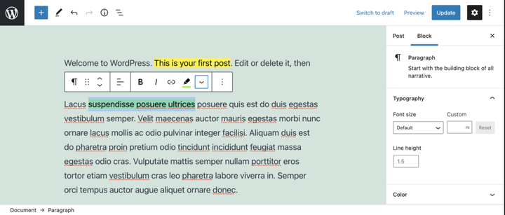
Vormingutüübi rakendamine Highlighteri pistikprogrammi abil.
Ülaltoodud video näitab Highlighteri pistikprogrammi, meie vormingutüüpi ja hüpikakent. Hüppame selle juurde.
Eeldused
- Lugege WordPressi plokiredaktori (Gutenbergi) pistikprogrammi loomise juhendit, et saaksite pistikprogrammi loomisel edumaa.
- Järgige artiklis Postitussisu vormindamine registerFormatType’iga toodud juhiseid .
- Soovi korral laadige GitHubist alla tasuta pistikprogramm Highlighter ja vaadake faili
/src/formats/highlight-colours.js
Looge modaal
Modaalse hüpikakna loomiseks kasutame olekut, et teha kindlaks, kas nuppu on klõpsatud või mitte. Selle useStateimportimiseks '@wordpress/element'.
Nupukomponendis, tagastuslause kohal, kasutame seda algoleku määramiseks ja oleku seadja funktsioonide loomiseks.
 // State to show popover.
 const [ showPopover, setShowPopover ] = useState( false );
Seejärel muudame oleku määramiseks nupu klõpsamise sündmust.
onClick={() => {
    setShowPopover( true );
} }
Nüüd, kui olek on määratud, saame seda kasutada hüpikakna käivitamiseks. Esmalt importige URLPopoverkomponent aadressilt '@wordpress/block-editor'. Seejärel lisage return-lauses nupu alla tingimus, mis võtab showPopovermuutuja ja renderdab URLPopover.
return (<>
    <RichTextToolbarButton
      icon='edit'
      onClick={() => {
        setShowPopover( true );
      } }
      title={ __( 'Highlight', 'wholesome-highlighter') }
      />
    { showPopover && (<URLPopover
        className="components-inline-color-popover"
        onClose={ () => setShowPopover( false) }
        >
        ...
      </URLPopover>) }
    </>)
Pange tähele, et oleme mähkinud kaks komponenti tühjade siltidega <></>. Need täidavad <Fragment>sildi eesmärki ja võimaldavad kahe JSX-i komponendi renderdamist ilma esiküljele märgistust väljastamata.
Lisage modaalse hüpikakna sisu
Kuna see on esiletõstmise pistikprogramm, impordime ColorPaletteselle '@wordpress/block-editor'modaalsest hüpikaknast ja asetame sellesse.
<URLPopover
   className="components-inline-color-popover"
   onClose={ () => setShowPopover( false) }
 >
 <ColorPalette
    onChange={ (color) => {
      setShowPopover( false );
      if (color) {
        onChange(
          applyFormat( value, {
            type: name,
            attributes: { style: `background-color: ${color};` },
          }
        ));
      } else {
        onChange( toggleFormat( value, { type: name }) );
      }
    } }
    />
</URLPopover>
Ülaltoodud kood kasutab hüpikaknas vaikevärvipaletti. Meie kohandatud värvide lisamiseks on vaja rohkem tööd.
Kood täielikult
Et demonstreerida, kuidas me paletti kohandatud värve lisame, on ilmselt kõige parem näidata täielikku koodi. Samuti saate selle faili alla laadida koos Githubi uusimate värskendustega.
import { ColorPalette, RichTextToolbarButton, URLPopover } from '@wordpress/block-editor';
import { useState } from '@wordpress/element';
import { __ } from '@wordpress/i18n';
import { Icon } from '@wordpress/icons';
import { applyFormat, registerFormatType, toggleFormat, useAnchorRef } from '@wordpress/rich-text';

import '../style.scss';

const name = 'wholesome/highlighter';
const cssClass = 'wholesome-highlight';

const HighlighterButton = (props) => {
    const { contentRef, isActive, onChange, value } = props;
    const { activeFormats } = value;
    const anchorRef = useAnchorRef( { ref: contentRef, value } );

    const highlighterIcon = <svg width="20" height="20" viewBox="0 0 20 20" fill="none" xmlns="http://www.w3.org/2000/svg">
        <path d="M14.2186 3.31061C13.7838 2.89252 13.0834 2.89708 12.6543 3.32078L9.22512 6.70711C9.17494 6.75668 9.13068 6.80978 9.09236 6.86558L7.36613 8.57021L11.393 12.4419L16.362 7.50771L16.6812 7.1925C17.1103 6.76879 17.1056 6.08638 16.6708 5.66828L14.2186 3.31061Z" fill="black"/>
        <path d="M6.81914 9.10588L10.8041 12.9457L9.79592 13.9391C9.42424 14.3053 8.84982 14.3575 8.42039 14.0938L7.83675 13.8883L7.01822 14.6819L5.03321 12.7381L5.86163 11.9349L5.67624 11.454C5.39121 11.0373 5.43547 10.4692 5.811 10.0992L6.81914 9.10588Z" fill="black"/>
        <path d="M5.11329 13.6189L6.13911 14.5945L5.70907 15L4 14.592L5.11329 13.6189Z" fill="black"/>
    </svg>;

    const [ showPopover, setShowPopover ] = useState( false );
    const [ activeColor, setActiveColor ] = useState( false );

    const colors = [
        { name: 'Yellow', color: '#fff300' },
        { name: 'Green', color: '#79fe0c' },
        { name: 'Blue', color: '#4af1f2' },
        { name: 'Purple', color: '#df00ff' },
        { name: 'Red', color: '#ff2226' },
        { name: 'Orange', color: '#ff7b19' },
        { name: 'Pink', color: '#ff70c5' },
    ];

    const getActiveColor = () => {
        const formats = activeFormats.filter( format => name === format['type'] );

        if (formats.length > 0) {
            const format = formats[0];
            const { attributes, unregisteredAttributes } = format;

            let atts = unregisteredAttributes;

            if (attributes && attributes.length) {
                atts = attributes;
            }

            if (! atts) {
                if (activeColor) {
                    return { backgroundColor: activeColor };
                }
                return;
            }

            if (atts.hasOwnProperty('class')) {

                const parts = atts.class.split( '--' );
                const colorName = parts[ parts.length - 1 ];
                const selectedColor = colors.filter( item => colorName === item.name.toLowerCase() )[0];
                return { backgroundColor: selectedColor.color };
            } else if (atts.hasOwnProperty('style')) {

                const { style } = atts;
                const parts = style.split( ': ' );
                const selectedColor = parts[ parts.length - 1 ].replace( ';', '' );
                return { backgroundColor: selectedColor };
            }
        }
    };

    return (<>
        <RichTextToolbarButton
            icon={
                <>
                    <Icon icon={ highlighterIcon } />
                    { isActive && (<span
                            className="format-library-text-color-button__indicator"
                            style={ getActiveColor() }
                        />) }
                </>
            }
            key={ isActive? 'text-color': 'text-color-not-active' }
            name={ isActive? 'text-color': undefined }
            onClick={ () => {
                setShowPopover( true );
            } }
            title={ __( 'Highlight', 'wholesome-highlighter') }
        />
        { showPopover && (<URLPopover
                anchorRef={ anchorRef }
                className="components-inline-color-popover"
                onClose={ () => setShowPopover( false) }
            >
                <ColorPalette
                    colors={ colors }
                    onChange={ (color) => {
                        setShowPopover( false );
                        setActiveColor( color );

                        if (color) {
                            const selectedColor = colors.filter( item => color === item.color );
                            const attributes  = {};
                            if (selectedColor.length) {

                                attributes.class = `${cssClass}--${selectedColor[0].name.toLowerCase()}`;
                            } else {

                                attributes.style = `background-color: ${color};`;
                            }
                            onChange(
                                applyFormat( value, {
                                    type: name,
                                    attributes,
                                }
                            ));
                        } else {
                            onChange( toggleFormat( value, { type: name }) );
                        }
                    } }
                />
            </URLPopover>) }
        </>) };

registerFormatType(
    name, {
        className: cssClass,
        edit: HighlighterButton,
        tagName: 'mark',
        title: __( 'Highlight', 'wholesome-highlighter' ),
    }
);
Määrake failis kindlasti oma kohandatud värvide värvid /src/style.scssja seal on see värvipaletiga markerpliiatsi vorming.
.wholesome-highlight {
    &.wholesome-highlight--yellow {
        background-color: #fff300;
    }

    &.wholesome-highlight--green {
        background-color: #79fe0c;
    }

    &.wholesome-highlight--blue {
        background-color: #4af1f2;
    }

    &.wholesome-highlight--purple {
        background-color: #df00ff;
    }

    &.wholesome-highlight--red {
        background-color: #ff2226;
    }

    &.wholesome-highlight--orange {
        background-color: #ff7b19;
    }

    &.wholesome-highlight--pink {
        background-color: #ff70c5;
    }
}
 Tõsta esile valitud värvi ikoon