
Vi har tidigare tittat på lagring av alternativ och inställningar med WordPress Block Editor (Gutenberg) och utökat Create Block Script för att tillåta extra slutpunkter. I den här guiden ska vi sätta ihop dem alla för att skapa en inställningssida med hjälp av Gutenberg-komponenter.
Inställningssidan vi håller på att bygga
Men först, tack vare beröm förtjänas, inspirationen för den här guiden går till Code in WP-artikeln av Hardeep Asrani: Making a ”Plugin Options Page" With Gutenberg Components.
Förutsättningar
- Har följt guiden Skapa ett plugin för WordPress Block Editor (Gutenberg) .
- Har följt guiden Använda alternativ för att lagra data i WordPress Block Editor (Gutenberg) .
- Har följt Lägg till ingångspunkter till WordPress Create Block Script- guiden
Skapa inställningssidan i PHP
Följ guiderna i förutsättningarna, öppna upp root-PHP-filen för plugin-programmet (i det här fallet wholesome-plugin.php) och lägg till följande:
Registrera inställningarna
Som i guiden för att använda alternativ för att lagra data, lägg till följande inställningar i filen:
function wholesomecode_wholesome_plugin_register_settings() {
    register_setting(
        'wholesomecode_wholesome_plugin_settings',
        'wholesomecode_wholesome_plugin_example_select',
        [
            'default'      => '',
            'show_in_rest' => true,
            'type'         => 'string',
        ]
    );

    register_setting(
        'wholesomecode_wholesome_plugin_settings',
        'wholesomecode_wholesome_plugin_example_text',
        [
            'default'      => '',
            'show_in_rest' => true,
            'type'         => 'string',
        ]
    );

    register_setting(
        'wholesomecode_wholesome_plugin_settings',
        'wholesomecode_wholesome_plugin_example_text_2',
        [
            'default'      => '',
            'show_in_rest' => true,
            'type'         => 'string',
        ]
    );

    register_setting(
        'wholesomecode_wholesome_plugin_settings',
        'wholesomecode_wholesome_plugin_example_text_3',
        [
            'default'      => '',
            'show_in_rest' => true,
            'type'         => 'string',
        ]
    );

    register_setting(
        'wholesomecode_wholesome_plugin_settings',
        'wholesomecode_wholesome_plugin_example_toggle',
        [
            'default'      => '',
            'show_in_rest' => true,
            'type'         => 'string',
        ]
    );
}
add_action( 'init', 'wholesomecode_wholesome_plugin_register_settings', 10 );
Registrera inställningarna som vi kommer åt på inställningssidan. Se till att ställa show_in_restin trueför var och en, så att de kan nås via Gutenberg.
Registrera inställningssidan
Lägg till kodblocket för att registrera inställningssidan:
function wholesomecode_wholesome_plugin_settings_page() {
    add_options_page(
        __( 'Wholesome Plugin Settings', 'wholesome-plugin' ),
        __( 'Wholesome Plugin Settings', 'wholesome-plugin' ),
        'manage_options',
        'wholesome_plugin_settings',
        function() {
            ?>
            <div id="wholesome-plugin-settings"></div>
            <?php
        },
    );
}
add_action( 'admin_menu', 'wholesomecode_wholesome_plugin_settings_page', 10 );
Koden ovan lägger till en ny sida i inställningsmenyn. Observera att allt det gör är att mata ut en <div>, detta är vad vi kommer att använda för att rendera de React-baserade Gutenberg-komponenterna.
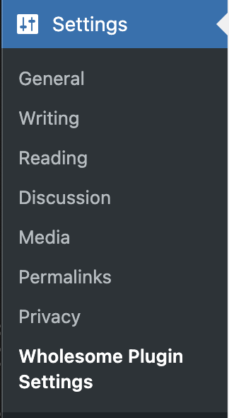 Menyalternativ för inställningar
Lägg administratörstillgångar i kö
För att komma till nästa kodblock måste vi ha följt alla steg i guiden Lägg till startpunkter till Skapa blockskript. Se till att du följer alla stegen i den guiden innan det här steget, och kom tillbaka och följ resten av den här guiden.
function wholesomecode_wholesome_plugin_admin_scripts() {
    $dir = __DIR__;

    $script_asset_path = "$dir/build/admin.asset.php";
    if (! file_exists( $script_asset_path)) {
        throw new Error(
            'You need to run `npm start` or `npm run build` for the "wholesomecode/wholesome-plugin" block first.'
        );
    }
    $admin_js     = 'build/admin.js';
    $script_asset = require( $script_asset_path );
    wp_enqueue_script(
        'wholesomecode-wholesome-plugin-admin-editor',
        plugins_url( $admin_js, __FILE__ ),
        $script_asset['dependencies'],
        $script_asset['version']
    );
    wp_set_script_translations( 'wholesomecode-wholesome-plugin-block-editor', 'wholesome-plugin' );

    $admin_css = 'build/admin.css';
    wp_enqueue_style(
        'wholesomecode-wholesome-plugin-admin',
        plugins_url( $admin_css, __FILE__ ),
        ['wp-components'],
        filemtime( "$dir/$admin_css") );
}
add_action( 'admin_enqueue_scripts', 'wholesomecode_wholesome_plugin_admin_scripts', 10 );
Bygg administratörssidan i JavaScript
Om du har följt alla steg i guiden Lägg till startpunkter till Skapa blockskript- guiden, bör du ha en /src/admin.jsfil. Öppna filen och ta bort innehållet.
Gör komponenten
Kom ihåg att köra npm starti din terminal enligt skapa plugin-guiden och lägg till nedanstående i din /src/admin.jsfil.
import './admin.scss';
import { Icon } from '@wordpress/components';
import {
    Fragment,
    render,
    Component,
} from '@wordpress/element';
import { __ } from '@wordpress/i18n';

class App extends Component {
    constructor() {
        super( ...arguments );
    }

    render() {
        return (<Fragment>
                <div className="wholesome-plugin__header">
                    <div className="wholesome-plugin__container">
                        <div className="wholesome-plugin__title">
                            <h1>{ __( 'Wholesome Plugin Settings', 'wholesome-plugin') } <Icon icon="admin-plugins" /></h1>
                        </div>
                    </div>
                </div>
                <div className="wholesome-plugin__main"></div>
            </Fragment>) }
}

document.addEventListener( 'DOMContentLoaded',() => {
    const htmlOutput = document.getElementById( 'wholesome-plugin-settings' );

    if (htmlOutput) {
        render(
            <App />,
            htmlOutput
        );
    }
});
Om du går till din inställningssida i webbläsaren bör du nu se följande:
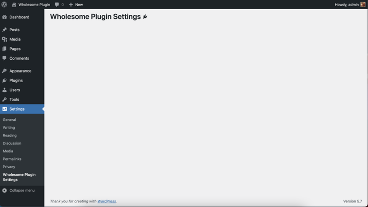 Rendera komponenter till inställningsskärmen
Lägg till inställningsfälten
Kommer du ihåg de extra stegen i guiden "Använda alternativ för att lagra data"? Tja, vi kommer i stort sett att klistra in dessa ordagrant i den här komponenten, så du bör sluta med någon kod som ser ut ungefär så här:
import './admin.scss';

import api from '@wordpress/api';

import {
    Button,
    Icon,
    Panel,
    PanelBody,
    PanelRow,
    Placeholder,
    SelectControl,
    Spinner,
    TextControl,
    ToggleControl,
} from '@wordpress/components';

import {
    Fragment,
    render,
    Component,
} from '@wordpress/element';

import { __ } from '@wordpress/i18n';

class App extends Component {
    constructor() {
        super( ...arguments );

        this.state = {
            exampleSelect: '',
            exampleText: '',
            exampleText2: '',
            exampleText3: '',
            exampleToggle: false,
            isAPILoaded: false,
        };
    }

    componentDidMount() {

        api.loadPromise.then(() => {
            this.settings = new api.models.Settings();

            const { isAPILoaded } = this.state;

            if (isAPILoaded === false) {
                this.settings.fetch().then( (response) => {
                    this.setState( {
                        exampleSelect: response[ 'wholesomecode_wholesome_plugin_example_select' ],
                        exampleText: response[ 'wholesomecode_wholesome_plugin_example_text' ],
                        exampleText2: response[ 'wholesomecode_wholesome_plugin_example_text_2' ],
                        exampleText3: response[ 'wholesomecode_wholesome_plugin_example_text_3' ],
                        exampleToggle: Boolean( response[ 'wholesomecode_wholesome_plugin_example_toggle' ] ),
                        isAPILoaded: true,
                    } );
                } );
            }
        } );
    }

    render() {
        const {
            exampleSelect,
            exampleText,
            exampleText2,
            exampleText3,
            exampleToggle,
            isAPILoaded,
        } = this.state;

        if (! isAPILoaded) {
            return (<Placeholder>
                    <Spinner />
                </Placeholder>
            );
        }

        return (<Fragment>
                <div className="wholesome-plugin__header">
                    <div className="wholesome-plugin__container">
                        <div className="wholesome-plugin__title">
                            <h1>{ __( 'Wholesome Plugin Settings', 'wholesome-plugin') } <Icon icon="admin-plugins" /></h1>
                        </div>
                    </div>
                </div>

                <div className="wholesome-plugin__main">
                    <Panel>
                        <PanelBody
                            title={ __( 'Panel Body One', 'wholesome-plugin') }
                            icon="admin-plugins"
                        >
                            <SelectControl
                                help={ __( 'An example dropdown field.', 'wholesome-plugin') }
                                label={ __( 'Example Select', 'wholesome-plugin') }
                                onChange={ (exampleSelect) => this.setState( { exampleSelect }) }
                                options={ [
                                    {
                                        label: __( 'Please Select...', 'wholesome-plugin' ),
                                        value: '',
                                    },
                                    {
                                        label: __( 'Option 1', 'wholesome-plugin' ),
                                        value: 'option-1',
                                    },
                                    {
                                        label: __( 'Option 2', 'wholesome-plugin' ),
                                        value: 'option-2',
                                    },
                                ] }
                                value={ exampleSelect }
                            />
                        </PanelBody>
                        <PanelBody
                            title={ __( 'Panel Body Two', 'wholesome-plugin') }
                            icon="admin-plugins"
                        >
                            <TextControl
                                help={ __( 'This is an example text field.', 'wholesome-plugin') }
                                label={ __( 'Example Text', 'wholesome-plugin') }
                                onChange={ (exampleText) => this.setState( { exampleText }) }
                                value={ exampleText }
                            />

                        </PanelBody>
                        <PanelBody
                            title={ __( 'Panel Body Three', 'wholesome-plugin') }
                            icon="admin-plugins"
                        >
                            <PanelRow>
                                <TextControl
                                    help={ __( 'Use PanelRow to place controls inline.', 'wholesome-plugin') }
                                    label={ __( 'Example Text 2', 'wholesome-plugin') }
                                    onChange={ (exampleText2) => this.setState( { exampleText2 }) }
                                    value={ exampleText2 }
                                />
                                <TextControl
                                    help={ __( 'This control is inline.', 'wholesome-plugin') }
                                    label={ __( 'Example Text 3', 'wholesome-plugin') }
                                    onChange={ (exampleText3) => this.setState( { exampleText3 }) }
                                    value={ exampleText3 }
                                />
                            </PanelRow>
                        </PanelBody>
                        <PanelBody
                            title={ __( 'Panel Body Four', 'wholesome-plugin') }
                            icon="admin-plugins"
                        >
                            <ToggleControl
                                checked={ exampleToggle }
                                help={ __( 'An example toggle.', 'wholesome-plugin') }
                                label={ __( 'Example Toggle', 'wholesome-plugin') }
                                onChange={ (exampleToggle) => this.setState( { exampleToggle }) }
                            />
                        </PanelBody>
                        <Button
                            isPrimary
                            isLarge
                            onClick={ () => {}}
                        >
                            { __( 'Save', 'wholesome-plugin') }
                        </Button>
                    </Panel>
                </div>
            </Fragment>) }
}

document.addEventListener( 'DOMContentLoaded', () => {
    const htmlOutput = document.getElementById( 'wholesome-plugin-settings' );

    if (htmlOutput) {
        render(
            <App />,
            htmlOutput
        );
    }
});
Bortsett från borttagningen av subscribein componentDidMountsom vi tidigare använde för att spara i den guiden, och tillägget av knappen, är koden i stort sett kopiera och klistra in.
Allt mår bra bör vår inställningssida nu se ut ungefär så här:
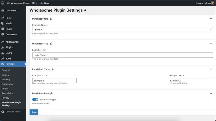 Återge inställningsfälten
Oroa dig inte, vi kommer att rensa upp stilarna i avsnitt 4 i den här guiden.
Hantera Spara
Lägg till följande kod i onClickhanteraren av komponenten:<button>
<Button
  isPrimary
  isLarge
  onClick={ () => {
    const {
      exampleSelect,
      exampleText,
      exampleText2,
      exampleText3,
      exampleToggle,
    } = this.state;

    const settings = new api.models.Settings( {
      [ 'wholesomecode_wholesome_plugin_example_select' ]: exampleSelect,
      [ 'wholesomecode_wholesome_plugin_example_text' ]: exampleText,
      [ 'wholesomecode_wholesome_plugin_example_text_2' ]: exampleText2,
      [ 'wholesomecode_wholesome_plugin_example_text_3' ]: exampleText3,
      [ 'wholesomecode_wholesome_plugin_example_toggle' ]: exampleToggle? 'true': '',
    } );
    settings.save();
  }}
  >
  { __( 'Save', 'wholesome-plugin') }
</Button>
Detta kommer att spara våra alternativ och inställningar när du klickar på knappen. Det finns dock inget som tyder på att alternativen har sparats som standard.
Skapa meddelandet
För att ge vår användare lite feedback om att alternativen och inställningarna har sparats, låter vi implementera en "snackbar"-avisering. Detta är samma meddelande som används på huvudskärmen för inläggsredigerare som blockredigeraren använder när inlägget har sparats.
För att lägga till detta måste vi porta in en Gutenberg-kärnkomponent i vår build, eftersom notifikationslistan inte är tillgänglig med de vanliga importsatserna.
Vi måste lägga till följande kod i filen:
import { SnackbarList } from '@wordpress/components';

import {
    dispatch,
    useDispatch,
    useSelect,
} from '@wordpress/data';

import { store as noticesStore } from '@wordpress/notices';

const Notices = () => {
    const notices = useSelect( (select) =>
            select( noticesStore) .getNotices()
                .filter( (notice) => notice.type === 'snackbar' ),
        []
    );
    const { removeNotice } = useDispatch( noticesStore );
    return (<SnackbarList
            className="edit-site-notices"
            notices={ notices }
            onRemove={ removeNotice }
        />
    );
};
Lägg sedan till följande i huvudrenderingen av <App>komponenten före stängningen </Fragment>:
<div className="wholesome-plugin__notices">
  <Notices/>
</div>
Lägg slutligen till följande till onClickhanteraren av knappen:
dispatch('core/notices').createNotice(
  'success',
  __( 'Settings Saved', 'wholesome-plugin' ),
  {
    type: 'snackbar',
    isDismissible: true,
  }
);
Detta kommer att skapa en liten "snackbar" popup när inställningarna sparas.
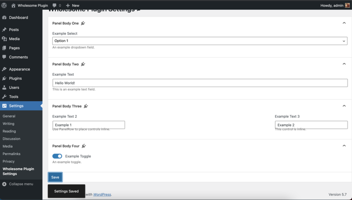 Snackbar-meddelande i aktion
Jag vet, jag vet, vi måste fortfarande fixa de stilarna.
Hela /src/admin.jsfilen
För referens här är den fullständiga /src/admin.jsfilkoden:
import './admin.scss';

import api from '@wordpress/api';

import {
    Button,
    Icon,
    Panel,
    PanelBody,
    PanelRow,
    Placeholder,
    SelectControl,
    SnackbarList,
    Spinner,
    TextControl,
    ToggleControl,
} from '@wordpress/components';

import {
    dispatch,
    useDispatch,
    useSelect,
} from '@wordpress/data';

import {
    Fragment,
    render,
    Component,
} from '@wordpress/element';

import { __ } from '@wordpress/i18n';

import { store as noticesStore } from '@wordpress/notices';

const Notices = () => {
    const notices = useSelect( (select) =>
            select( noticesStore) .getNotices()
                .filter( (notice) => notice.type === 'snackbar' ),
        []
    );
    const { removeNotice } = useDispatch( noticesStore );
    return (<SnackbarList
            className="edit-site-notices"
            notices={ notices }
            onRemove={ removeNotice }
        />
    );
};

class App extends Component {
    constructor() {
        super( ...arguments );

        this.state = {
            exampleSelect: '',
            exampleText: '',
            exampleText2: '',
            exampleText3: '',
            exampleToggle: false,
            isAPILoaded: false,
        };
    }

    componentDidMount() {

        api.loadPromise.then( () => {
            this.settings = new api.models.Settings();

            const { isAPILoaded } = this.state;

            if (isAPILoaded === false) {
                this.settings.fetch().then( (response) => {
                    this.setState( {
                        exampleSelect: response[ 'wholesomecode_wholesome_plugin_example_select' ],
                        exampleText: response[ 'wholesomecode_wholesome_plugin_example_text' ],
                        exampleText2: response[ 'wholesomecode_wholesome_plugin_example_text_2' ],
                        exampleText3: response[ 'wholesomecode_wholesome_plugin_example_text_3' ],
                        exampleToggle: Boolean( response[ 'wholesomecode_wholesome_plugin_example_toggle' ] ),
                        isAPILoaded: true,
                    } );
                } );
            }
        } );
    }

    render() {
        const {
            exampleSelect,
            exampleText,
            exampleText2,
            exampleText3,
            exampleToggle,
            isAPILoaded,
        } = this.state;

        if (! isAPILoaded) {
            return (<Placeholder>
                    <Spinner />
                </Placeholder>
            );
        }

        return (<Fragment>
                <div className="wholesome-plugin__header">
                    <div className="wholesome-plugin__container">
                        <div className="wholesome-plugin__title">
                            <h1>{ __( 'Wholesome Plugin Settings', 'wholesome-plugin') } <Icon icon="admin-plugins" /></h1>
                        </div>
                    </div>
                </div>

                <div className="wholesome-plugin__main">
                    <Panel>
                        <PanelBody
                            title={ __( 'Panel Body One', 'wholesome-plugin') }
                            icon="admin-plugins"
                        >
                            <SelectControl
                                help={ __( 'An example dropdown field.', 'wholesome-plugin') }
                                label={ __( 'Example Select', 'wholesome-plugin') }
                                onChange={ (exampleSelect) => this.setState( { exampleSelect }) }
                                options={ [
                                    {
                                        label: __( 'Please Select...', 'wholesome-plugin' ),
                                        value: '',
                                    },
                                    {
                                        label: __( 'Option 1', 'wholesome-plugin' ),
                                        value: 'option-1',
                                    },
                                    {
                                        label: __( 'Option 2', 'wholesome-plugin' ),
                                        value: 'option-2',
                                    },
                                ] }
                                value={ exampleSelect }
                            />
                        </PanelBody>
                        <PanelBody
                            title={ __( 'Panel Body Two', 'wholesome-plugin') }
                            icon="admin-plugins"
                        >
                            <TextControl
                                help={ __( 'This is an example text field.', 'wholesome-plugin') }
                                label={ __( 'Example Text', 'wholesome-plugin') }
                                onChange={ (exampleText) => this.setState( { exampleText }) }
                                value={ exampleText }
                            />

                        </PanelBody>
                        <PanelBody
                            title={ __( 'Panel Body Three', 'wholesome-plugin') }
                            icon="admin-plugins"
                        >
                            <PanelRow>
                                <TextControl
                                    help={ __( 'Use PanelRow to place controls inline.', 'wholesome-plugin') }
                                    label={ __( 'Example Text 2', 'wholesome-plugin') }
                                    onChange={ (exampleText2) => this.setState( { exampleText2 }) }
                                    value={ exampleText2 }
                                />
                                <TextControl
                                    help={ __( 'This control is inline.', 'wholesome-plugin') }
                                    label={ __( 'Example Text 3', 'wholesome-plugin') }
                                    onChange={ (exampleText3) => this.setState( { exampleText3 }) }
                                    value={ exampleText3 }
                                />
                            </PanelRow>
                        </PanelBody>
                        <PanelBody
                            title={ __( 'Panel Body Four', 'wholesome-plugin') }
                            icon="admin-plugins"
                        >
                            <ToggleControl
                                checked={ exampleToggle }
                                help={ __( 'An example toggle.', 'wholesome-plugin') }
                                label={ __( 'Example Toggle', 'wholesome-plugin') }
                                onChange={ (exampleToggle) => this.setState( { exampleToggle }) }
                            />
                        </PanelBody>
                        <Button
                            isPrimary
                            isLarge
                            onClick={ () => {
                                const {
                                    exampleSelect,
                                    exampleText,
                                    exampleText2,
                                    exampleText3,
                                    exampleToggle,
                                } = this.state;

                                const settings = new api.models.Settings( {
                                    [ 'wholesomecode_wholesome_plugin_example_select' ]: exampleSelect,
                                    [ 'wholesomecode_wholesome_plugin_example_text' ]: exampleText,
                                    [ 'wholesomecode_wholesome_plugin_example_text_2' ]: exampleText2,
                                    [ 'wholesomecode_wholesome_plugin_example_text_3' ]: exampleText3,
                                    [ 'wholesomecode_wholesome_plugin_example_toggle' ]: exampleToggle? 'true': '',
                                } );
                                settings.save();

                                dispatch('core/notices').createNotice(
                                    'success',
                                    __( 'Settings Saved', 'wholesome-plugin' ),
                                    {
                                        type: 'snackbar',
                                        isDismissible: true,
                                    }
                                );
                            }}
                        >
                            { __( 'Save', 'wholesome-plugin') }
                        </Button>
                    </Panel>
                </div>

                <div className="wholesome-plugin__notices">
                    <Notices/>
                </div>

            </Fragment>) }
}

document.addEventListener( 'DOMContentLoaded', () => {
    const htmlOutput = document.getElementById( 'wholesome-plugin-settings' );

    if (htmlOutput) {
        render(
            <App />,
            htmlOutput
        );
    }
});
Lägg till SCSS
Dags att fixa de stilarna. Lägg bara till följande i /src/admin.scssfilen (som du skulle ha skapat i guiden Add Entry Points to the Create Block Script- guide.
#wholesome-plugin-settings {

    .components-placeholder {
        background: #f1f1f1;
    }

    .wholesome-plugin__header {
        background-color: #ffffff;
        box-shadow: 0 1px 0 rgba(213, 213, 213, .5), 0 1px 2px #eeeeee;
        margin-left: -2em;
        padding: 20px 10px;

        .wholesome-plugin__container {
            margin: 0 auto;
            max-width: 750px;

            .wholesome-plugin__title {
                align-items: center;
                display: flex;
                justify-content: center;

                .dashicon {
                    color: #757575;
                }
            }
        }
    }

    .wholesome-plugin__main {
        margin-left: auto;
        margin-right: auto;
        max-width: 750px;

        .components-panel {
            background: none;
            border: none;
        }

        .components-panel__body {
            background: #ffffff;
            border: 1px solid #e2e4e7;
            margin: 1rem 0;
        }
    }

    .components-base-control__help {
        margin-top: .5rem;
    }

    .components-panel__row {
        > div {
            flex-grow: 1;
            margin-right: 1rem;

            &:last-of-type {
                margin-right: 0;
            }
        }
    }

    .wholesome-plugin__notices {
        .components-snackbar {
            bottom: .5rem;
            position: fixed;
        }
    }
}
Visa inställningssidan
Här är slutresultatet:
 Inställningssidan
Vissa plugin-program har en "inställningar"-länk på plugin-sidan så här:
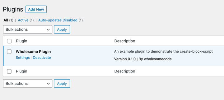 Inställningslänk på panelen med insticksinställningar
För att uppnå detta lägg till följande kodblock i roten av din plugin-fil (i det här fallet wholesome-plugin.php):
function wholesomecode_wholesome_plugin_settings_link( $links ): array {
    $label = esc_html__( 'Settings', 'wholesome-plugin' );
    $slug  = 'wholesome_plugin_settings';

    array_unshift( $links, "<a href='options-general.php?page=$slug'>$label</a>" );

    return $links;
}
add_action( 'plugin_action_links_'. plugin_basename( __FILE__ ), 'wholesomecode_wholesome_plugin_settings_link', 10 );
- Ta en titt på att skapa kapslade underordnade block med
InnerBlockskomponenten - Ta en titt på hur du använder post-metafält i Gutenberg-block
- Ta en titt på att skapa en anpassarpanel med Gutenberg-komponenter